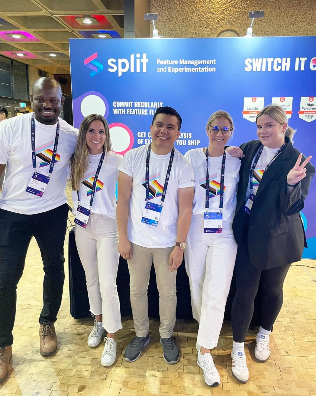
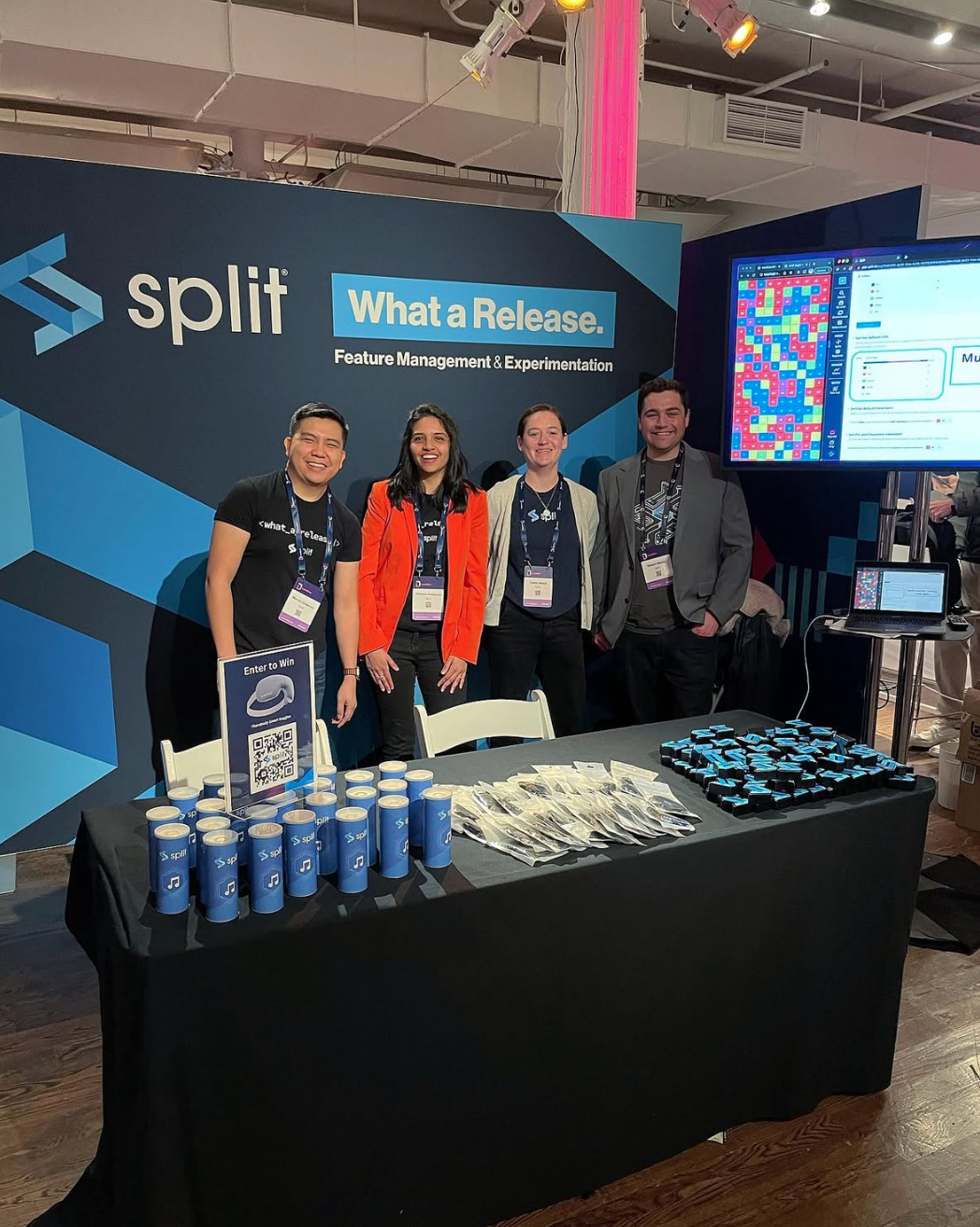
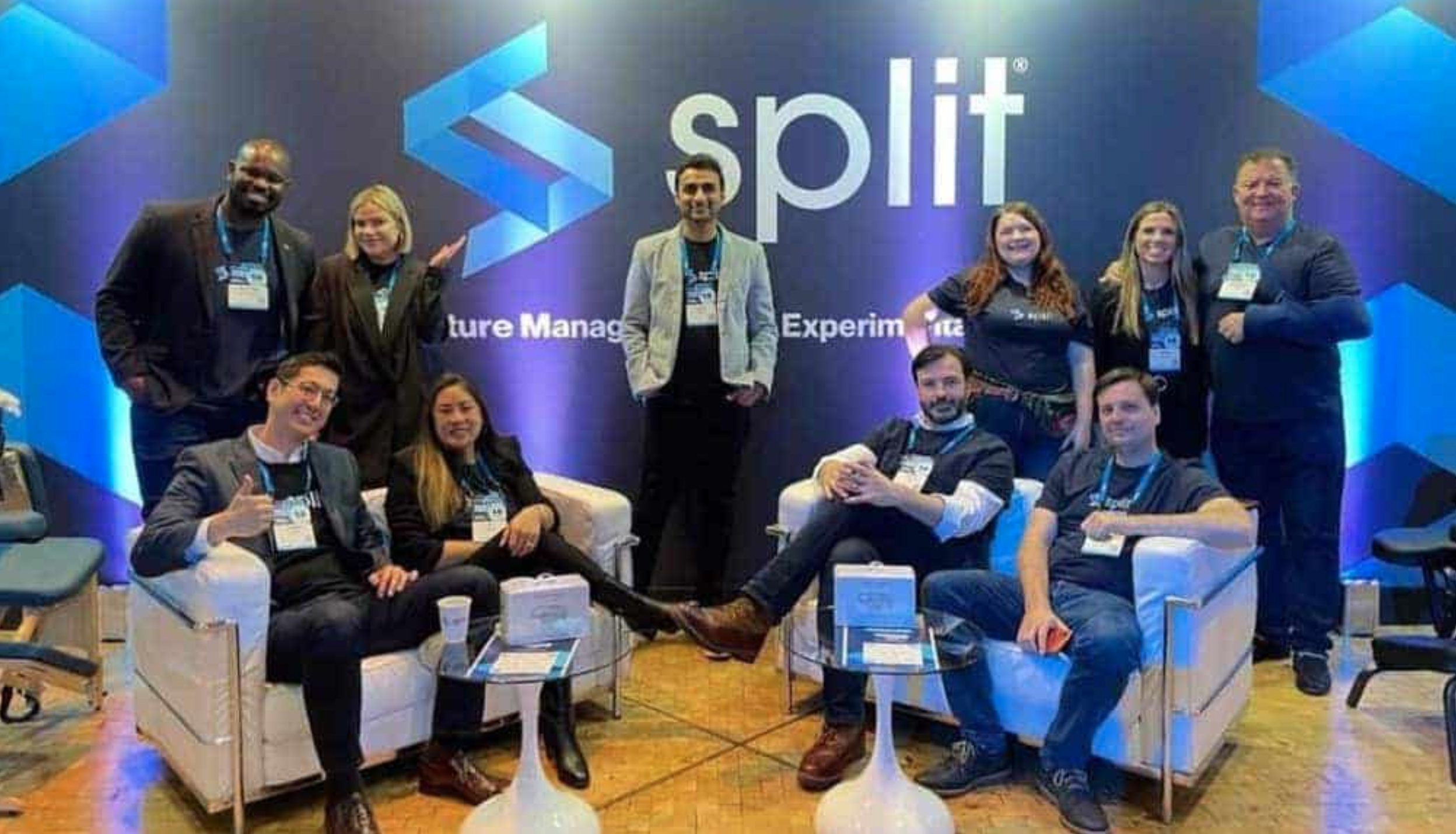
SPLIT SOFTWARE
Branding and web design for a Bay Area SaaS startup.
Role: Creative Direction and Design
Vinyl sign in Split’s first office space
A look at the initial brand and corporate site design for Split.
SERVICES
Creative direction, branding, graphic design, iconography, web IA / UI / UX design.
TECHNOLOGY AND TOOLS
Trello - project management and communication
Illustrator - logo and iconography design
Photoshop - asset production, animation
Sketch - website design and prototyping
Dropbox - asset storage and sharing
ON THE WEB
PROJECT DETAILS
The founders approached us to refine their brand to better represent the company, for securing funding and attracting talent.
ABOUT SPLIT
Split is a software startup with a feature delivery platform designed for engineering teams to deploy code with controlled releases, which promised to increase release cadence without sacrificing quality or stability. They focus on a specialized niche of feature flagging and rapid iteration based on feedback.
DEVELOPING THE BRAND
Initially, Trevor Stuart, the company Co-Founder and President, approached Working Concept with a request to create an enterprise brand position that would instill confidence in investors as they sought series funding. At the time, they had just received seed funding and only had a private beta with placeholder landing page.
The leadership team understood that they needed to improve their brand presentation while rapidly positioning themselves to hire team members and cultivate a web presence demonstrating product features and company information.
Create a brand and corporate site to instill confidence in investors and legitimize Split's product.
GOALS
Develop a logo to drive the evolution of Split’s brand, extending to application branding and corporate website
Evoke an enterprise feel, retain some startup playfulness
Create a visual language consistent with tone: iconography, illustrations, animations of key product features
Communicate the Split value proposition, appeal to key buyers and decision-makers
THE LOGO
Utilizing the teams' goals and the current product color palette, we began refining the initial logo to start establishing a visual style.
The team already knew they wanted a bold mark as a primary part of the logo, so we looked at ways to incorporate that into our sketches.
Create a logo with a prominent "S" shape that evokes a feeling of stable product experiences.
Split's product is geared towards engineering and development processes and we wanted to pull that into the core brand identity. Brackets naturally lent themselves to creating an abstract 'S' shape and were aligned with the product and brand goals.
They wanted a logo that could easily stand alone as an app icon, on swag, for event branding, and more.
Angled bracket sketches
Many of these iterations have had some time to shine through Split's continued brand evolution.
Logo concepts
Refreshed colors on a new office sign
ICONS
Split's goal was to convey trustworthiness and enterprise level service while keeping in touch with their startup roots.
We looked at different icon and illustration styles to introduce playfulness and balance the overall tone of the site.
Create an icon set that retains an approachable, bold, and playful feel.
We created a series of sketches representing a list of company values, employment benefits and product features to test out different visual styles with the team. These low fidelity concepts were developed into high fidelity versions for layout testing.
Concept sketches
Refinements
The completed set of icons is bold, clean and minimal, utilizing color tones to remain adaptable and engaging.
Finished style showcasing culture and product icons
FIRST WEBSITE
The leadership team had a large amount of technical information that needed to be organized and presented in a reassuring way.
Plan and design the first corporate marketing website to support Split's move out of private beta, that keeps in touch with Split's startup roots.
We took their documentation and developed a simple site plan. From there we validated assumptions and identified areas that may need video, product screenshots or other supporting assets.
From the plan to low fidelity wireframes, we continued to collaborate closely to make sure we were conveying the correct information. High fidelity UI followed for feedback and approvals before development and launch.

Site planning

Wireframes
Values

Product page

Customer targeting animation
Split editor animation
Integrations animation
RESULTS
The site served as proof of legitimacy to gain customers and grow their team.
The logo designs have continued to grow with the brand, supporting color changes, gradients and outline variations used across the product, at events and in marketing materials.
The results of our collaboration delivered a flexible brand, the basis of which supported their Series A round of funding on through Series D and an acquisition by Harness in 2024.
The initial design continues to grow and evolve with the brand.

