SHAREBUILDER APP
Design of an award-winning application recognized with a Gold Stevie® Award in Business/Government for Financial Services.
Role: Creative Director
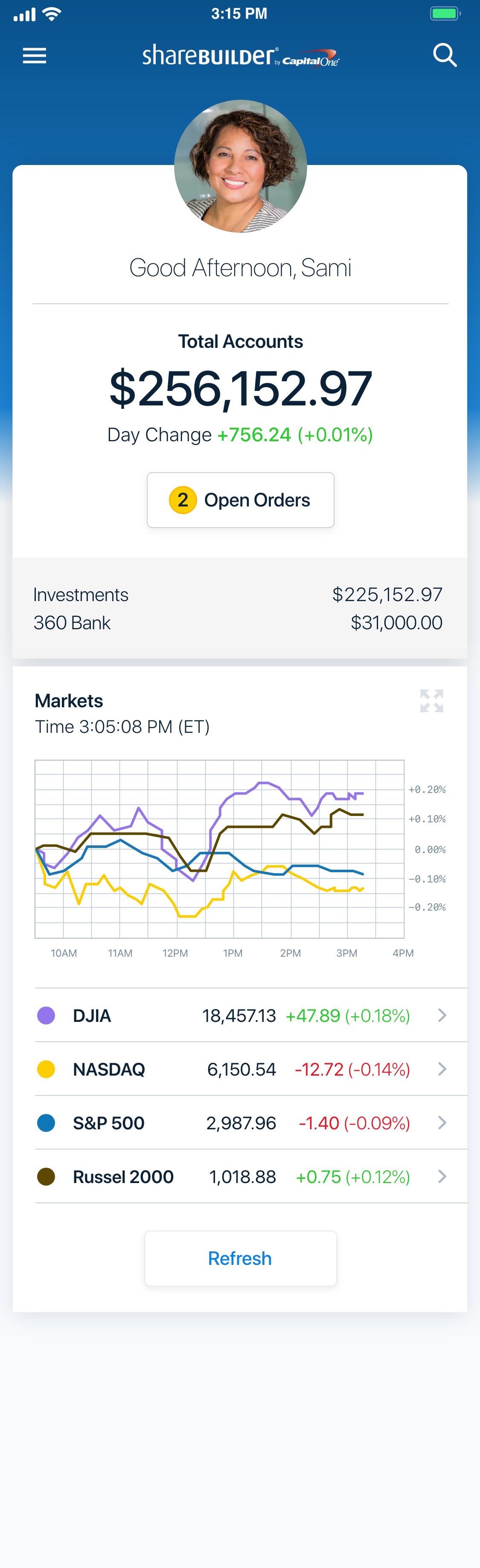
Markets and account overview screens
A look at the complete redesign of ShareBuilder mobile investing.
SERVICES
Creative direction, user research, competitive analysis, strategy, user flow and user experience optimization, design system, mobile product UI/UX design, usability testing, and quality assurance.
AWARDS
Gold Stevie® Award in Business/Government for Financial Services
Bronze Stevie® Award in Utilities & Services for Financial Services
TECHNOLOGY AND TOOLS
Axure Blueprint - live cast to mobile devices for interactive review
Axure RP - UX design and prototypes
Illustrator - icon design
iOS and Android SDKs - UI kits, localization, libraries, common controls
Photoshop - design mockups and asset production
Sketch - information architecture diagrams and interaction flow planning
Jira - project management
Trello - project management
E*TRADE ACQUISITION
“E*Trade Financial Corp will acquire 1 million retail brokerage accounts with around $18 billion of clients' assets from Capital One Financial, it said on Thursday.”
— Reuters
PROJECT DETAILS
My design team was tasked with rebranding the mobile investment offerings and designing a new trading app.
ABOUT SHAREBUILDER
The ShareBuilder startup offered investors discounted brokerage fees and automatic investments that saw the platform reach approximately 1 million accounts and an acquisition by Capital One.
In order to track with Capital One’s business goals—and launch rebranded under Capital One Investing—it was necessary to bring the platform into alignment with the parent brand. Usability improvements and new feature offerings were also needed to maintain a competitive edge in the market of online brokerage offerings.
Lead the design of an app driven by user research and a targeted reduction in call center volume.
GOALS
Review and catalog common call center help topics and target problem areas—KPI: Reduce call center volume, resulting from mobile self-service trading errors, by 20%
Evaluate current mobile investment products to identify areas to implement design and usability improvements—KPI: Retain existing customer base and attract new accounts
Develop a design system, with considerations for OS specific UI elements and behaviors
Extend Capital One’s parent brand to the ShareBuilder platform, align mobile product with Capital One apps when possible
USER RESEARCH
Identifying priorities for design and usability improvements based on data from user testing and customer feedback.
A number of key opportunities were highlighted during focus groups and from call center support logs. Priority was assigned based on whether an investor was impeded—in account creation, placing a trade or viewing positions—followed by access and password problems, and then any high volume views or activities that people found frustrating.

CHALLENGE
Account views are overwhelming and it takes too long to find and act on information
Mobile was suffering from a desktop design
Multiple hit area conflicts, lots of errors selecting and navigating
Investors had difficulty understanding what to do next, a lot of cognitive load
Positions lacked movement indicators, requiring extra taps to get information that competitors offered at a glance
Duplicate labels between header and menu
DESIGN SOLUTIONS
We reorganized menus and removed most of the chrome in favor of contextual interface elements. Quick switching between accounts was achieved with a top level account switch, the corrected information cascade reduced the number of choices and taps for a investor to view their account details.
CHALLENGE
The app landing screen is annoying and does not feel professional
No indication which carousel choices can be accessed without signing in
Investors were forced to choose a tile before any useful application information was available—including whether markets were open or closed
Buggy functionality that sometimes blocked selecting a tile if it did not rotate
The carousel was an exact duplicate of the bottom app navigation
Carousel feels too playful and outdated for a financial investing app
DESIGN SOLUTIONS
We moved towards an active landing screen with customizable sorting that provided market data and messaging without signing in. The unauthenticated home screen could also display device watch lists and related news, allowing the app to be a research tool before even creating an account.
The authenticated home screen became a high level overview of relevant account information, top holdings, and market data. Each snippet on the home screen represented an area of the app, tapping on a snippet navigated to the associated location. This intuitive navigation increased investor satisfaction and helped them find information quickly without excessive taps.
DESIGN AUDIT
Reviewing the current product from a design perspective.
In addition to user feedback, we also audited the current state of the ShareBuilder mobile investment products. We documented areas of risk in regards to navigational patterns and potential device conflicts—app switching and launch functionality, hardware and software keys, browser chrome for mobile web—any user experience improvements the design team placed high value on.
OPPORTUNITY
The trade funnel user experience is clunky, with poor labels and navigation.
Cluttered layout with high risk for navigational errors resulting in mistakenly exiting before completing a trade
Too many labels and label variations, with some being actionable and others static
Trade funnel allows user actions that will result in errors—buttons are active even when all required fields are not filled out
Error messaging is a blanket statement, missing field level guidance and contextual messaging
DESIGN SOLUTIONS
We redesigned the trade experience, starting with revised requirements to develop a new user flow that was mapped to wireframe designs.
New contextual features—like a share calculator—added value to the user experience.
Logic was applied to deactivate buttons if all of the required information was not entered, reducing the number of errors user received.
Navigation was reduced to the bare minimum essential functions, this helped bring focus back to the activity.
COMPETITIVE ANALYSIS
Highlighting competitor strengths, weaknesses, and areas of opportunity.
We surveyed competitor brands translated across web and mobile offerings to develop design recommendations. These views were paired with existing ShareBuilder screens to compare and contrast the functionality and designs.

Filters and details at a glance were more robust across almost every other competitor. Competitors offered a customizable device watch list in an unauthenticated view.

Identified as an area of opportunity, no competitor was a clear standout from a design or usability perspective. Room to offer contextual features that added significant value to investors.
FLOWS & WIREFRAMES
Organizing and optimizing the user experience.
We created interactive user flow documentation that detailed required content and functionality, the diagrams were mapped to wireframes to guide the product design.

High level app diagram

Sign in flow with associated content and functionality

Mapped sign in functionality on wireframes

Error messaging design and behaviors
UI DESIGN